ROLES:
UX RESEARCHER
UX DESIGNER
ANIMATOR
INFO. ARCHITECT
USER TESTER
04
GAMIFYING DIGITAL ADOPTION FOR YOUNG RETAIL WORKERS
#AGILE
#SURVEY ANALYSIS
Utilizing the Agile process, we yielded a design that gamified the process of learning a new POS system for retail workers ages 16-23.
In analyzing a 100+ person survey of essential workers, my team and I discovered that younger retail workers had more anxiety about digital adoption than older workers. This not only challenged our assumptions, but it also provided a set of pain points for a specific target audience.
#TEAM
WHAT
WHO
WHY
GOAL
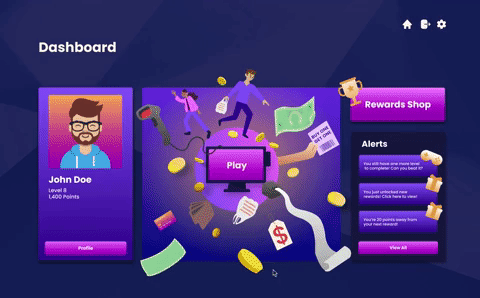
My team and I were tasked with discovering challenges that frontline workers faced in adopting new workplace technology. Our system gamifies the process of learning a new POS system. It works by encouraging muscle memory to adapt to a new Point of Sale (POS) system. As users play this game, they are exposed to a variety of situations in which they will utilize various functions of the POS system. As the game progresses, the buttons' labels are removed. This is to encourage users' muscle memory. This increases speed by cutting down the time a users spends visually scanning for a particular button.
From a 100+ person survey, we discovered that frontline workers under the age of 18 experienced more anxiety when it came to learning new technology at work than their older counterparts. This surprised us because we assumed anxiety would increase with age. Because of this, we narrowed our target audience to younger frontline workers who may be experiencing anxiety about adopting new technology. My team and I felt this data was too interesting to ignore. Knowing that many frontline workers are age 18 and younger, we believed it would be very crucial to address this particular audience's needs.
In our research, we also uncovered information on the type of training younger retail workers received. Many of them found the training videos boring and "cringey", which lead to a lack of informational absorption. We found that this was the source of anxiety in digital adoption —workers lacked foundational knowledge because they were not provided with a method of training that stimulated them. By alleviating this issue, my team and I wanted to prepare them for the problem solving and adaptability they will need in later employment, thus reducing their anxiety in adopting new technology within the workplace.
PRELIMINARY RESEARCH
PROCESS
We put out an initial survey of about 20 questions that gauged frontline workers’ feelings about digital adoption. After assessing with data we selected some critical date points that would guide the rest of our research and testing. These data points included ideas Despite the fact that most survey respondents preferred a hand-on style of learning, a majority of respondents received video training. After this survey, we conducted interviews with persons that matched our narrowed target audience: retail workers under or around the age of 18 years old. Here's what we got:
SURVEY TAKEAWAYS
-
Video training felt way too simple and like it “held your hand”
-
Video trainings were boring and monotonous
-
Video trainings were “cringey” which made it difficult to actually absorb the information


A combination of all these generative research methods lead us to crafting the personas which would represent our target users. This lead to the creation of our ideal personas who have the following characteristics:
PERSONA QUALITIES
-
High school age (16-18 yrs)
-
Dissatisfied with the training they previously received
-
Anxious about adopting new technology within the workplace


IDEATION
We started out with quickly pushing out as many solutions as possible in a short period of time. We then put these up in a FigJam and had fellow designers (who were working on other projects) graph them on an impact matrix. The impact matrix lead us in the gamification direction. We then began doing quick sketches to see how exactly the game would function. We decided on a simulation game for the hands on feel. We also combined this idea with my own idea of removing buttons on the retail POS system as the game increases in difficulty. I got inspiration for this idea from the brain training games used by Lumonisity.


USER TESTING
As we moved into the design phase we immediately started testing. It helped us move through the phases of low, mid, and high fidelity. We began our design phase by sketching up our first MVP. We then tested this with 3 users to confirm that our idea was necessary and if the flow of screens matched target users’ mental models. After a smooth testing session, we started on first digital iterations. Digital iterations received 3 rounds of testing with 5 to 6 users in each round. We also utilized a script to be consistent and uncover as much information as possible. Here's what we learned and how it guided our changes:
KEY TAKEAWAYS
-
All users immediately recognized our system as a game.
-
The play button was not the first thing they saw and only knew to click it by process of elimination.
-
The points reward progress bar was confusing. Users didn’t know what they were working towards.
-
Testers wanted to click on the Rewards Points module on the page that displays an individual game’s stats.
-
Users were confused about the difference between scanning an item and using the button labeled with that item’s name on the POS system during gameplay.
-
Users wanted to know what exactly they need to do to unlock the next level of the game.
CHANGES
-
More information about the mistakes the user made after a completed level was added.
-
The exact number of mistakes rather than just overall accuracy or ambiguous score is shown
-
Added an indication of why bonus points were rewarded so users could strive to repeat that action.
-
The illustrations that indicate which customer the user made a mistake with were modified to be the exact same style and crop as the illustration displayed in game.
-
Users wanted to be able to view the rewards they did not have enough points for to see if they should save or spend their points.


DESIGN LIBRARY
To ensure consistency and scalability, my team and I constructed an entire design library that extensively laid out the style guide's application to every part of the system. We began at the atomic level and moved to the largest level. We also designed what every state would look like throughout the system, which includes: hover, pressed, and disabled. This was my first time creating a design library to this degree. It was time consuming but, in the end, very rewarding. As we added pages, it was really simple to drag and drop each element as needed! This helped me in my subsequent projects as I made organized, consistent, and scalable design systems.

SOLUTION